Web Generated Survey Reports
A JavaScript object oriented approach to generate survey reports out of JSON data.
A JavaScript object oriented approach to generate survey reports out of JSON data.
One of my least favorite things to do at work is create survey reports.
Adaptiva does a big survey or two every year on topics like Windows 10 or buzzworthy security topics, and once all the data has been reviewed and written about, I’m supposed to turn it into a pretty, branded document.
Oh my god it’s so tedious.
I ended up building these documents in Apple Pages/Numbers because I found it more intuitive than Microsoft Word/Excel. Either way, it sucked and I was really starting to dread doing this.
Our latest Windows 10 survey report released today, and I’m happy to say it’s all in the web now, generated by a reusable JavaScript object-driven system.
Our surveys all have the same structure: each question in the survey has a title, a key takeaway, an excerpt, and the data in graph and table format.
There’s also a total number of responses for each question. Because some questions are “check all that apply,” it’s important to have a predefined total to divide against, rather than dividing against the total of all responses.
This makes it really easy to store the data to populate the survey in simple JSON. An array of objects with properties to match: title, takeaway, and excerpt are all strings. total is a number, and data is an object with the properties answer, a string for the answer option, and count, a number representing the number of people who selected that answer.
Here’s an example:
{
  title: 'How long do you estimate it will take to migrate your entire organization to Windows 10?',
  takeaway: 'Most companies expect to complete their migrations in the next 12 months.',
  excerpt: 'Forty percent of respondents suggested their company will complete their Windows 10 migration in six months or less. Another 21% expect it to take a full year. Over a third (39%) plan to take more than a year to move all their systems to the new OS.',
  responses: 420,
  data: {
    opt1: {
      answer: '1 month or less',
      count: 45,
    },
    opt2: {
      answer: '2-3 months',
      count: 55,
    },
    opt3: {
      answer: '4-6 months',
      count: 65,
    },
    opt4: {
      answer: '7-12 months',
      count: 90,
    },
    opt5: {
      answer: 'More than 1 year',
      count: 165,
    }
  }
}
The object constructor function takes in the parameteres title, takeaway, excerpt, total, and data.
function Graph(title, takeaway, excerpt, total, data) {
  $this = this;
  $this.title = title;
  $this.takeaway = takeaway;
  $this.excerpt = excerpt;
  $this.totalResponses = total;
  $this.data = data;
  // ...
}
I created DOM nodes to be used to render the Graph.
question = $('<div></div>'),
graph = $('<div></div>'),
table = $('<div></div>'),
totalResp = $('<div></div>');
Then, I created a method on the Graph object called _render(). First, we configure the DOM nodes.
$this._render = function(n) {
  // set a flag for if any values in the graph are > 50%
  var over50 = false;
  graph.addClass('question-graph');

  table
  .addClass('question-table')
  .html('<div class="j-row question-table-header">' + '<div class="j-col j-col-8"><h4 class="white">Answer Choices</h4></div>' + '<div class="j-col j-col-4"><h4 class="white">Responses</h4></div>' + '</div>' + '<div class="j-row question-table-content"></div>');

  question.attr({
    'class': 'question collapsible-section js-scroll',
    'id': 'question-' + (n + 1),
  })
  .html('<h2 class="question-title blue collapsible-title is-expanded">' + $this.title + '</h2>' + '<div class="collapsible-section--content is-expanded">' + '<div class="question-takeaway"><strong>Takeaway: ' + $this.takeaway + '</strong></div>' + '<p class="question-excerpt">' + $this.excerpt + '</p>' + '</div>')
  .appendTo('.survey-container')
  .find('.question-excerpt')
  .before(graph)
  .after(table);
  // ...
}
Cool. Next, to populate the graph and table. I looped through the data object and added rows to the graph and table for each entry inside data.
Since we’re always working with bar graphs that are percentage based, I can create simple div elements with a height and background color, then apply the percentage value from the data directly to the width property inline.
// first check to see if ANY values are > 50%
for (response in $this.data) {
  if (($this.data[response].count / $this.totalResponses * 100) > 50) {
    // if so, set flag to true
    over50 = true;
  }
}

for (response in $this.data) {
  var
  graphRow = $('<div></div>'),
  graphBar = $('<div></div>'),
  tableContent = table.find('.question-table-content'),
  tableRow = $('<div></div>'),
  percentage = Math.round((($this.data[response].count / $this.totalResponses * 100) + 0.00001) * 100) / 100;

  graphRow.attr({
    'class': 'j-row question-graph-row',
    'data-percent': percentage,
  })
  .html('<div class="j-col j-col-3 question-graph-label"><span>' + $this.data[response].answer + '</span></div>')
  .appendTo(graph);

  graphBar.attr({
    'class': 'question-graph-bar j-col j-col-9'
  });

  if (!over50) {
    // if no values > 50%
    // multiply widths of all graph bars by 2 for ~*aesthetics*~
    graphBar
    .html('<div class="question-graph-bar-data" style="width:' + (percentage * 2) + '%; max-width: 0;" title="' + $this.data[response].answer + ' - ' + percentage + '%"></div>' + '<span class="gray type-small">' + percentage + '%</span>')
    .appendTo(graphRow);

  } else {
    // else just match width to percentage value
    graphBar
    .html('<div class="question-graph-bar-data" style="width:' + percentage + '%; max-width: 0;" title="' + $this.data[response].answer + ' - ' + percentage + '%"></div>' + '<span class="gray type-small">' + percentage + '%</span>')
    .appendTo(graphRow);

  }

  tableRow.attr({
    'class': 'j-row question-table-row',
    // add percentage value for sorting
    'data-percent': percentage,
  })
  // add data to table row and add to table
  .html('<div class="j-col j-col-8 question-table-option" data-th="Answer"><span>' + $this.data[response].answer + '</span></div>' + '<div class="j-col j-col-2 question-table-percent" data-th="Response"><span>' + percentage + '%</span></div>' + '<div class="j-col j-col-2 question-table-count" data-th="Response Count"><span>' + $this.data[response].count + '</span></div>')
  .appendTo(tableContent);

} // end loop

// add total responses at bottom of table
totalResp.attr({
  'class': 'j-row'
})
.html('<h4 class="j-col j-col-8 black question-table-total">Total</h4>' + '<div class="j-col j-col-4 question-table-count" data-th="Total Respondents"><span>' + $this.totalResponses + '</span></div>')
.appendTo(table);
Some questions required the graph and table to be sorted by response in descending order, so I created a function expression called sortData() to handle that.
sortData = function(n) {
  console.log('Sorting data for Question #' + (n + 1));
  var
  sortedQuestion = $('#question-' + (n + 1)),
  sortedGraph = sortedQuestion.find('.question-graph'),
  sortedTable = sortedQuestion.find('.question-table-content');

  sortedGraph.find('.question-graph-row').sort(function(a, b) {
    return ($(a).data('percent')) < ($(b).data('percent')) ? 1 : -1;
  }).appendTo(sortedGraph);

  sortedTable.find('.question-table-row').sort(function(a, b) {
    return ($(a).data('percent')) < ($(b).data('percent')) ? 1 : -1;
  }).appendTo(sortedTable);
};
Nice! Now everything is in place to actually put the data on the page. All the JSON data is stored in a global array called questions, so all I have to do is loop through that array and construct a new Graph using each object’s properties as the parameters for the constructor.
$.each(questions, function(i) {
  // create new Graph object for each question
  questions[i] = new Graph(
    questions[i].title,
    questions[i].takeaway,
    questions[i].excerpt,
    questions[i].responses,
    questions[i].data
  );
  // render graph on page
  questions[i]._render(i);
  // sort questions that need sorting
  if (questions[i].hasOwnProperty('sorted')) {
    console.log('Question #' + (i + 1) + ' flagged for sorting');
    sortData(i);
  }
});
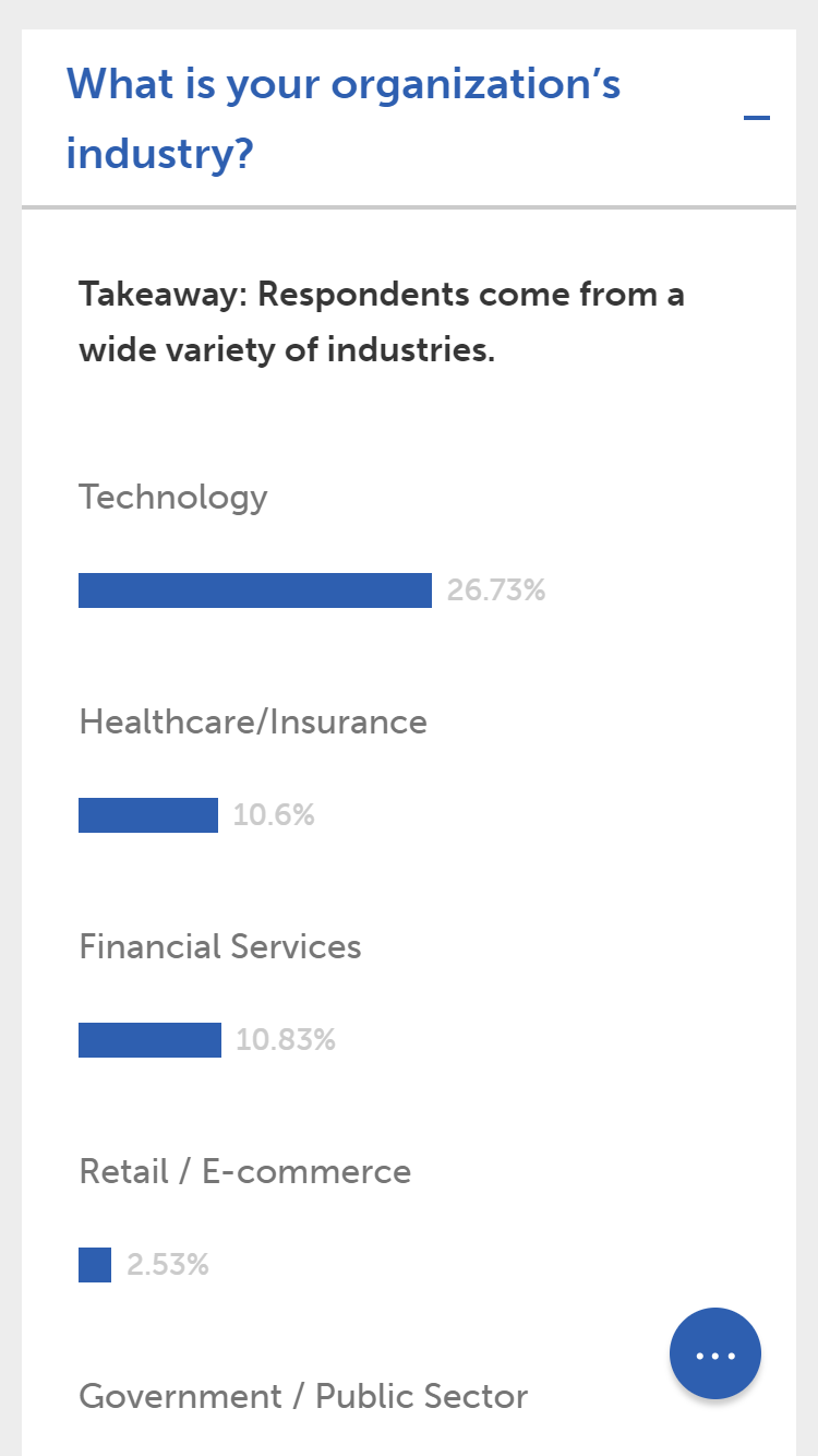
Easy. And it renders on the page like so.
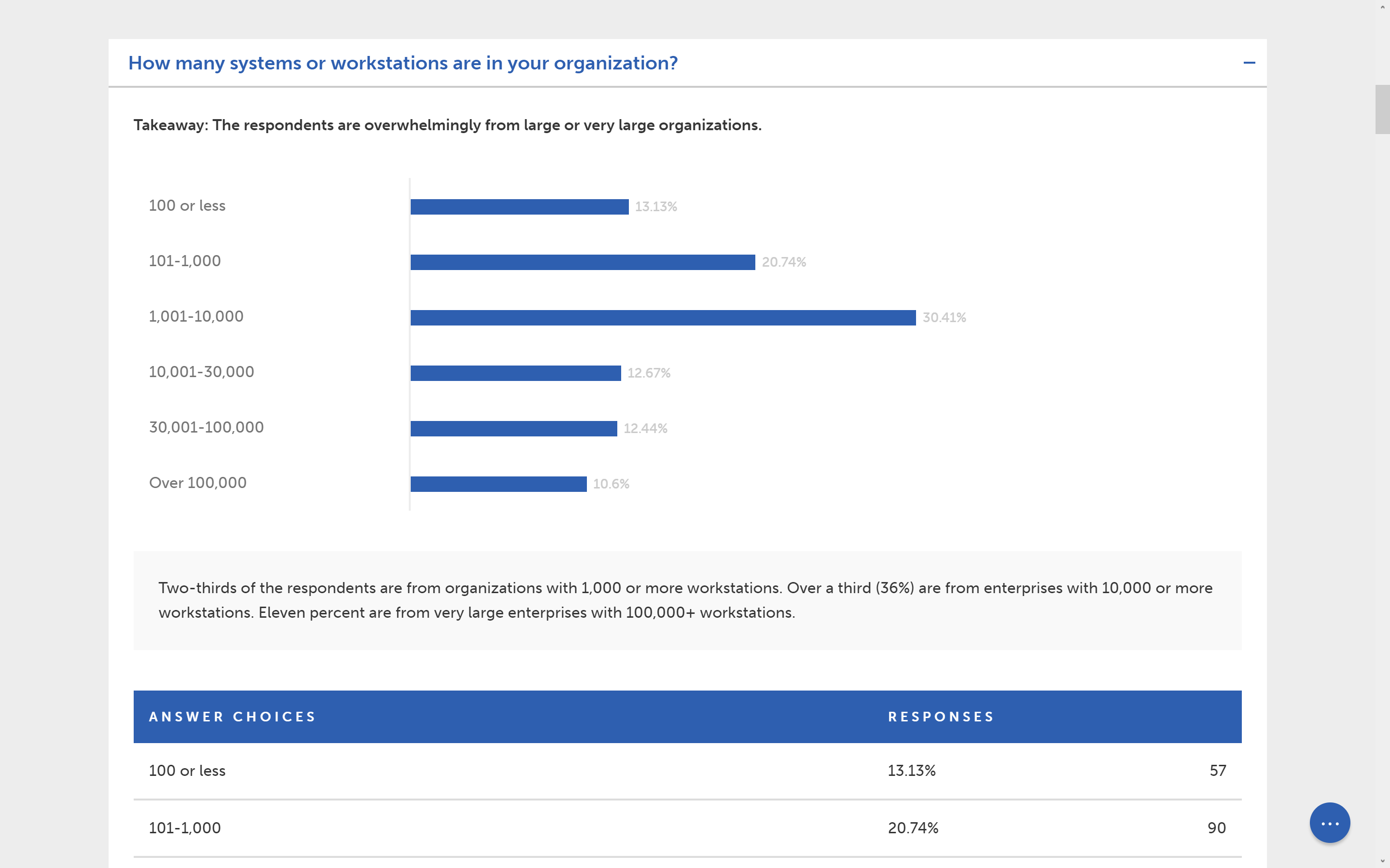
I decided to make each question/graph collapsible to allow the user to digest information in a more focused manner, if they want. Users can click on the title of the question to toggle expansion.

I took it one step further and made a Google-esque menu that comes out of a little circle stuck in the bottom right corner of the screen. Thanks for the inspo, Google Inbox.
The circle with the dots has a nice little hover animation, and the dots animate into an ‘X’ on click to indicate that the menu can be toggled out. Opening the menu brings up a white gradient on the screen to draw attention to the menu items and help with legibility.
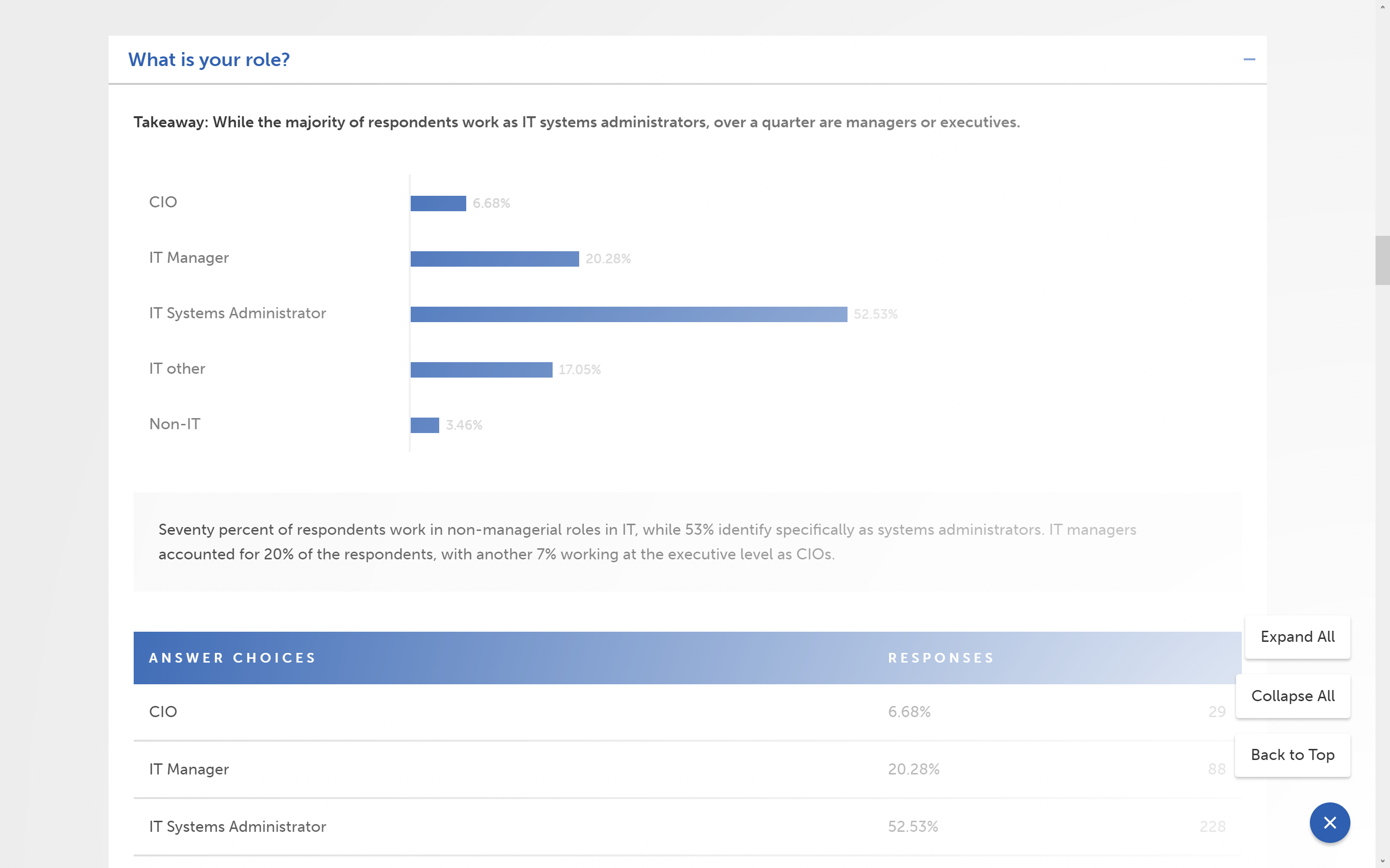
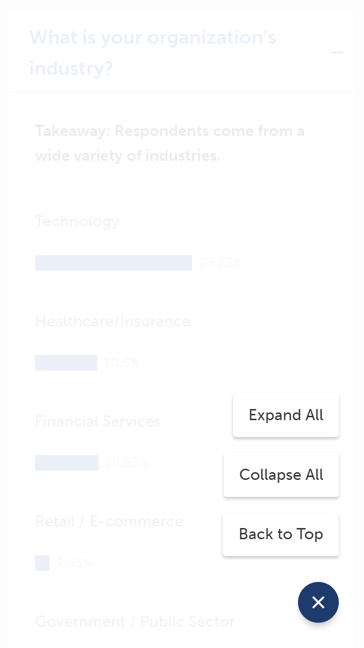
The menu allows the user to quickly scroll back to the top of the page, collapse all questions, or expand all questions.
There’s a little more to this, like animations and a little DOM manipulation, but this is all that I found interesting enough to write about.
I probably spent like a day and a half from start to finish on coding this. Manually designing survey reports in productivity software like Word or Pages took about a full day, assuming we didn’t have to scrap parts of it to make drastic copy changes, which can extend the time frame to hilarious measures.
Writing simple JSON to run all this code and generate this report took about 20 minutes, and making changes is remarkably easy and low impact.
Not only will this system save significant time in the future, but I believe it provides a vastly superior experience to a static PDF, especially on mobile devices.
Check out the live survey here.
Thanks for reading, Jesse