Adaptiva Design Lab Website
Custom design and development to create a website and blog for the Adaptiva Design Lab
Custom design and development to create a website and blog for the Adaptiva Design Lab
This is the tale of a website.
In Q2 of 2017, I got tired of updating and exporting annoyingly large PDF files of the Adaptiva brand guidelines, so I decided to hop on the Github Pages train and put all that documentation online.
Of course, once I started coding, I couldn't stop and ended up creating a full-on website and blog for my team, the Adaptiva Design Lab.
Aside from being really fun to make, the website serves two purposes:
Putting guidelines and assets in an online location, easily accessible from any device would go a long way toward making sure our staff and vendors stay current on the brand.
And making our brand assets (logos, product logos, type faces, etc.) available for download in multiple formats and resolutions should help our employees from finding some deprecated file off Google Images
I chose to really push the envelope on the visual design here. Since the site is built on a very simple framework we've been putting together in-house, I thought it'd be fun to see how flexible our system really was.
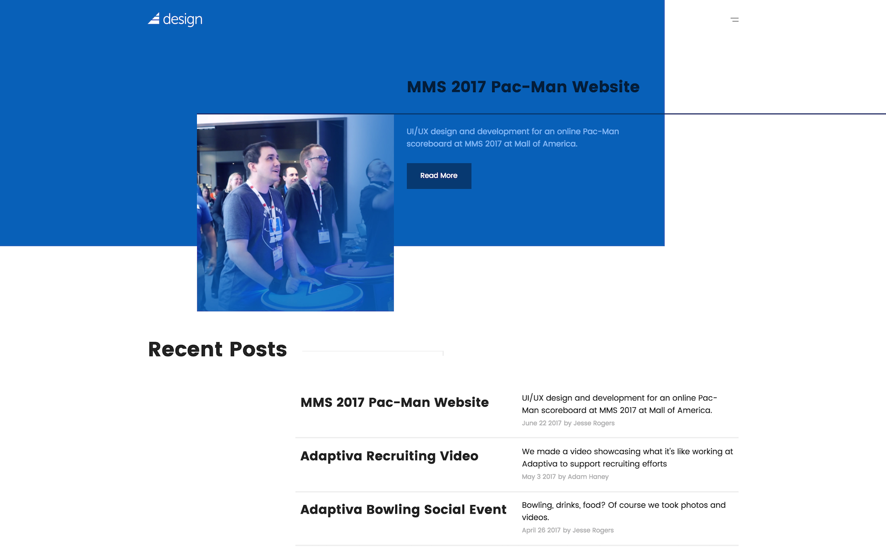
Abstract, asymmetrical layouts are the name of the game here.
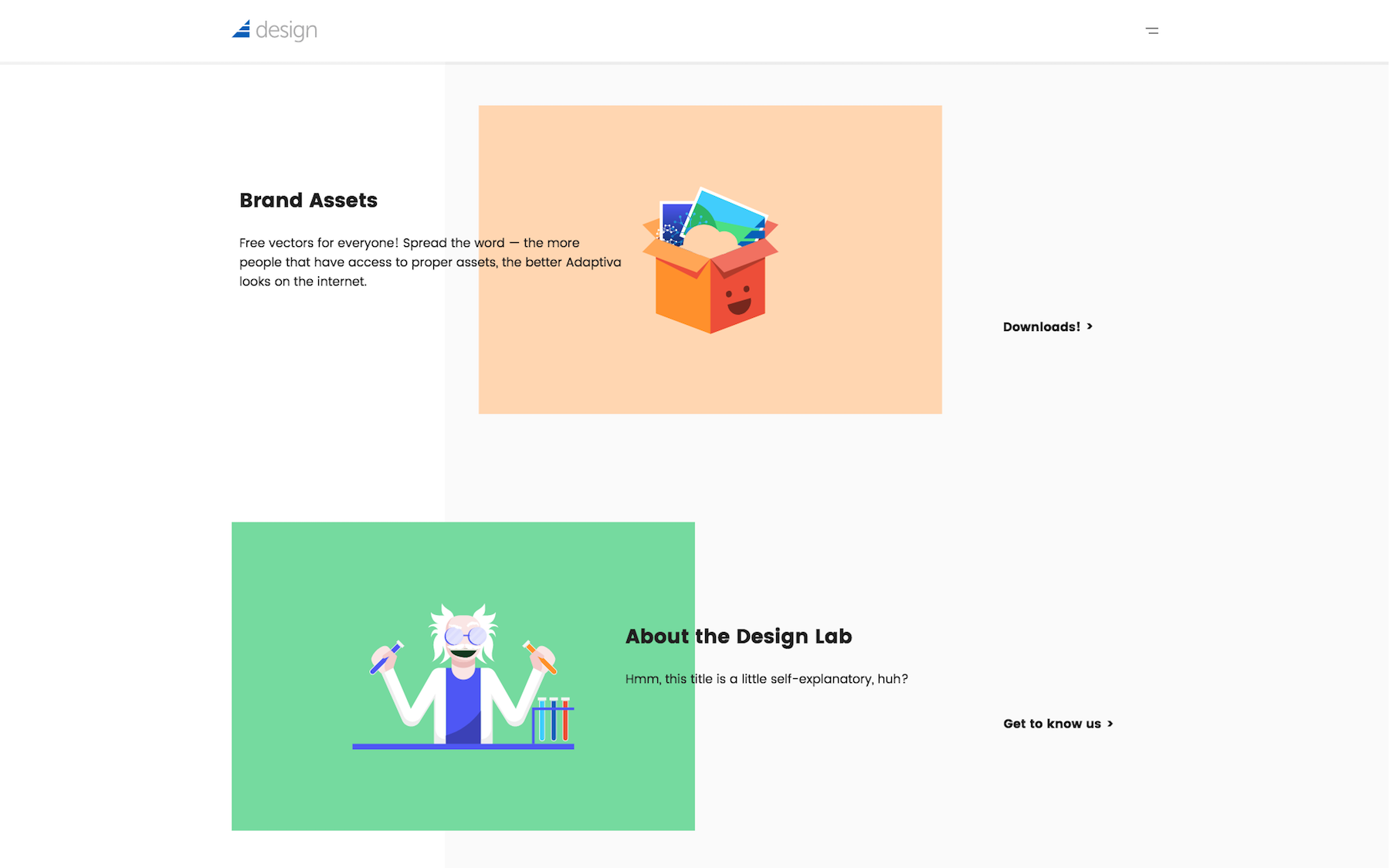
Our system utilizes a 12-column grid, so I basically just pushed everything around on the grid until it looked awesome.
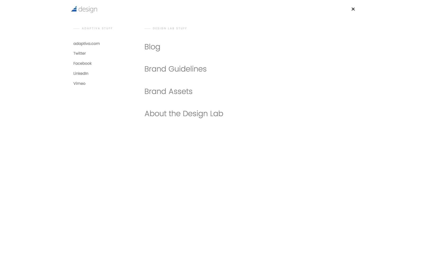
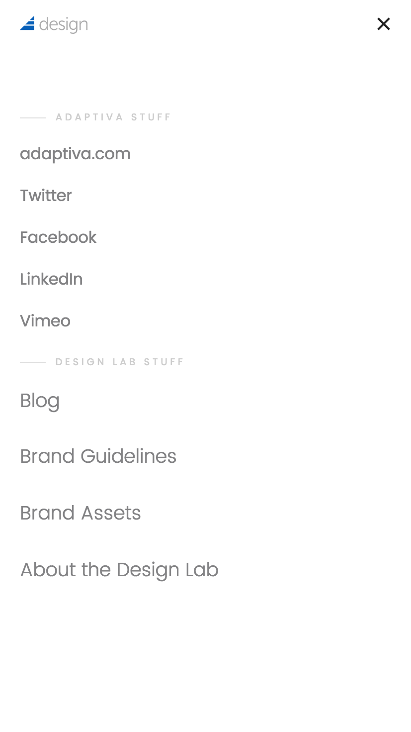
I wanted this site to be somewhat device agnostic — or at least I wanted it to feel that way to the user. I opted to go with a toggled, mobile-style navigation on all devices.
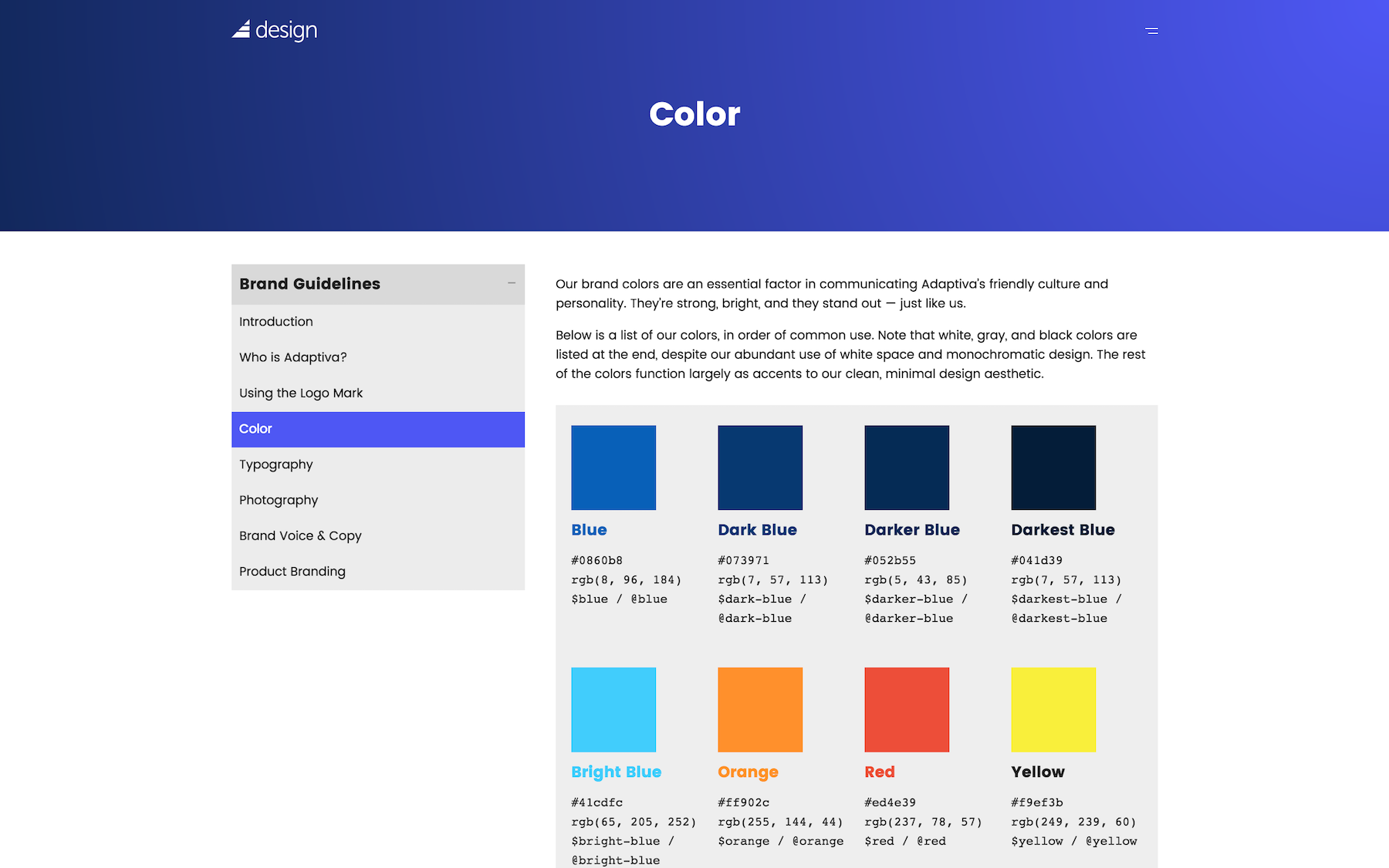
The guidelines page on the site features a nice little collapsible side nav.
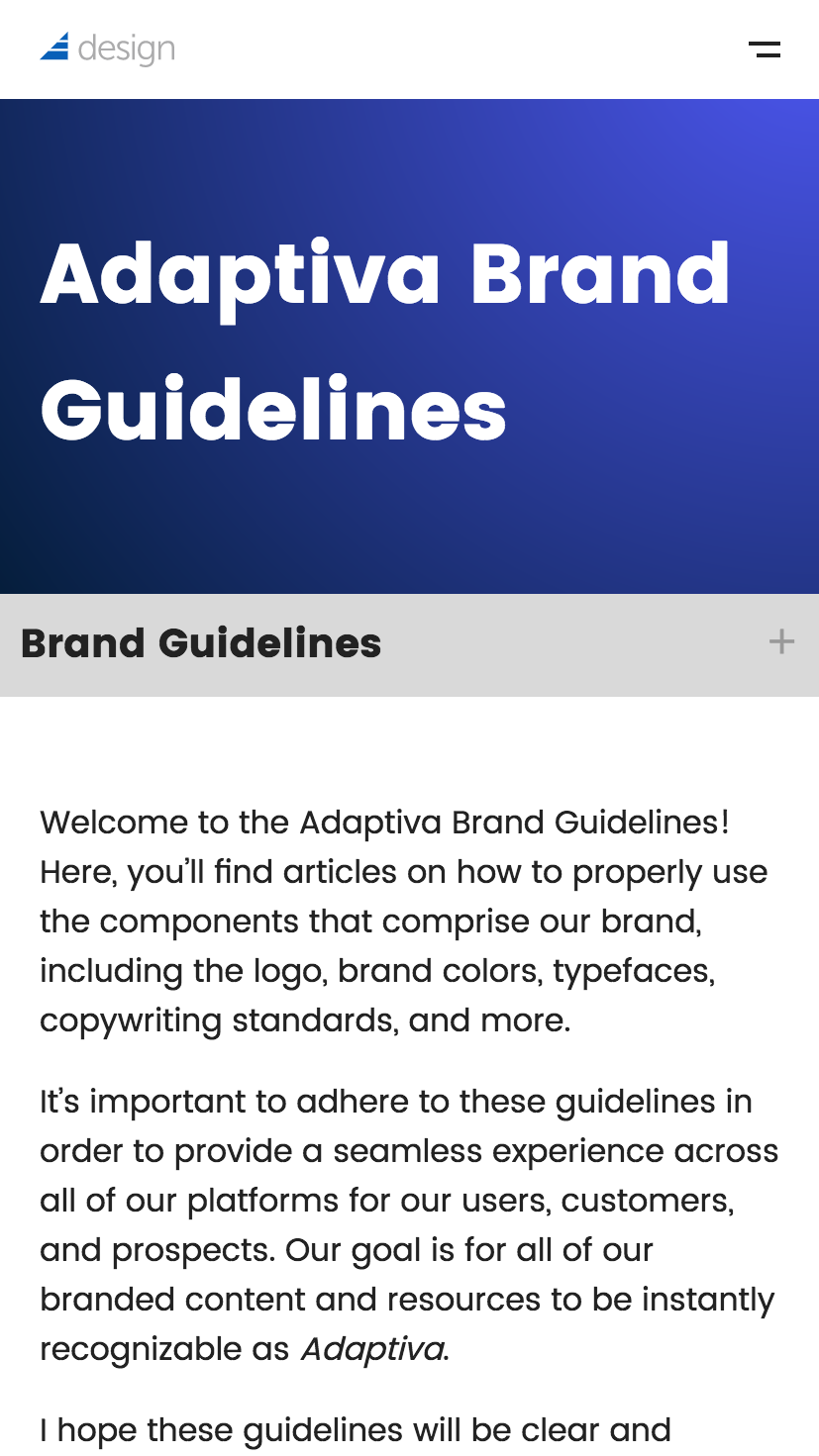
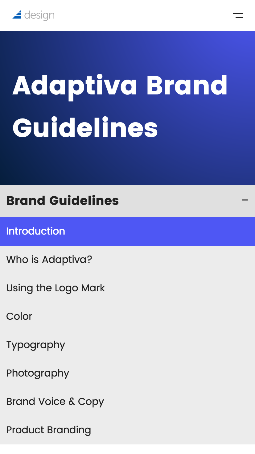
The side nav moves underneath the banner on mobile devices, but maintains the same functionality.
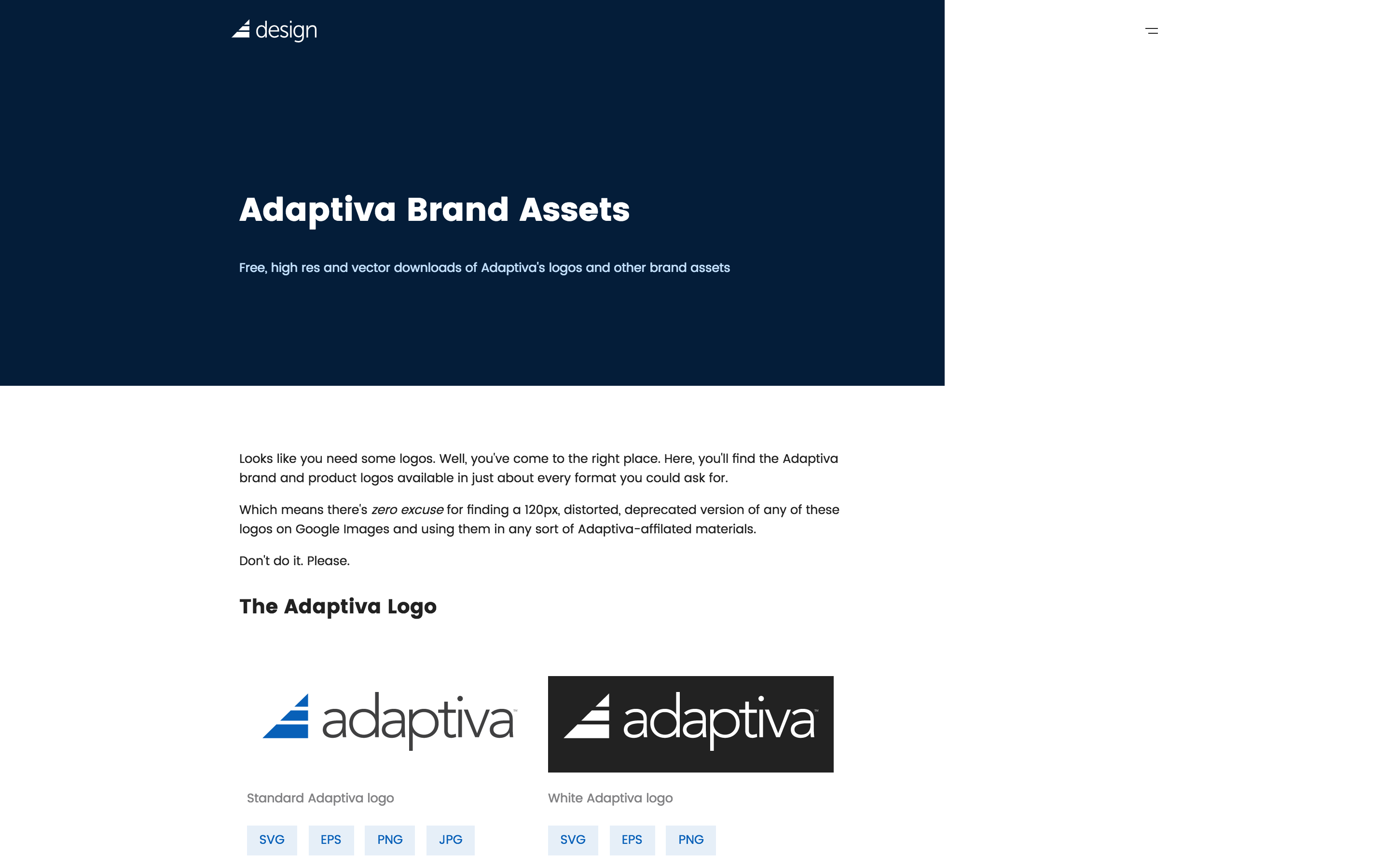
The brand assets page was designed to be as straight forward as possible, unlike the rest of the site. I mean, I got my abstract fix from the banner at the top, but otherwise, it's a giant grid with labels and little buttons.
Each file has links to at least three different file formats, including vector.
At the end of each section is a "download all" button, just to make things even easier.
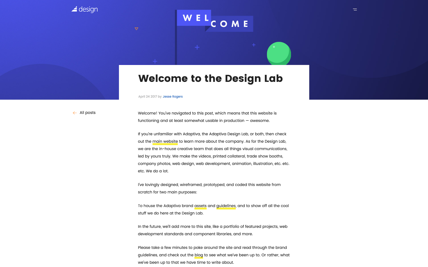
I also created a full blog feature into the site, complete with authoring, featured posts, pagination, etc. Blog posts have featured images, which are used as hero banners for the post page itself.
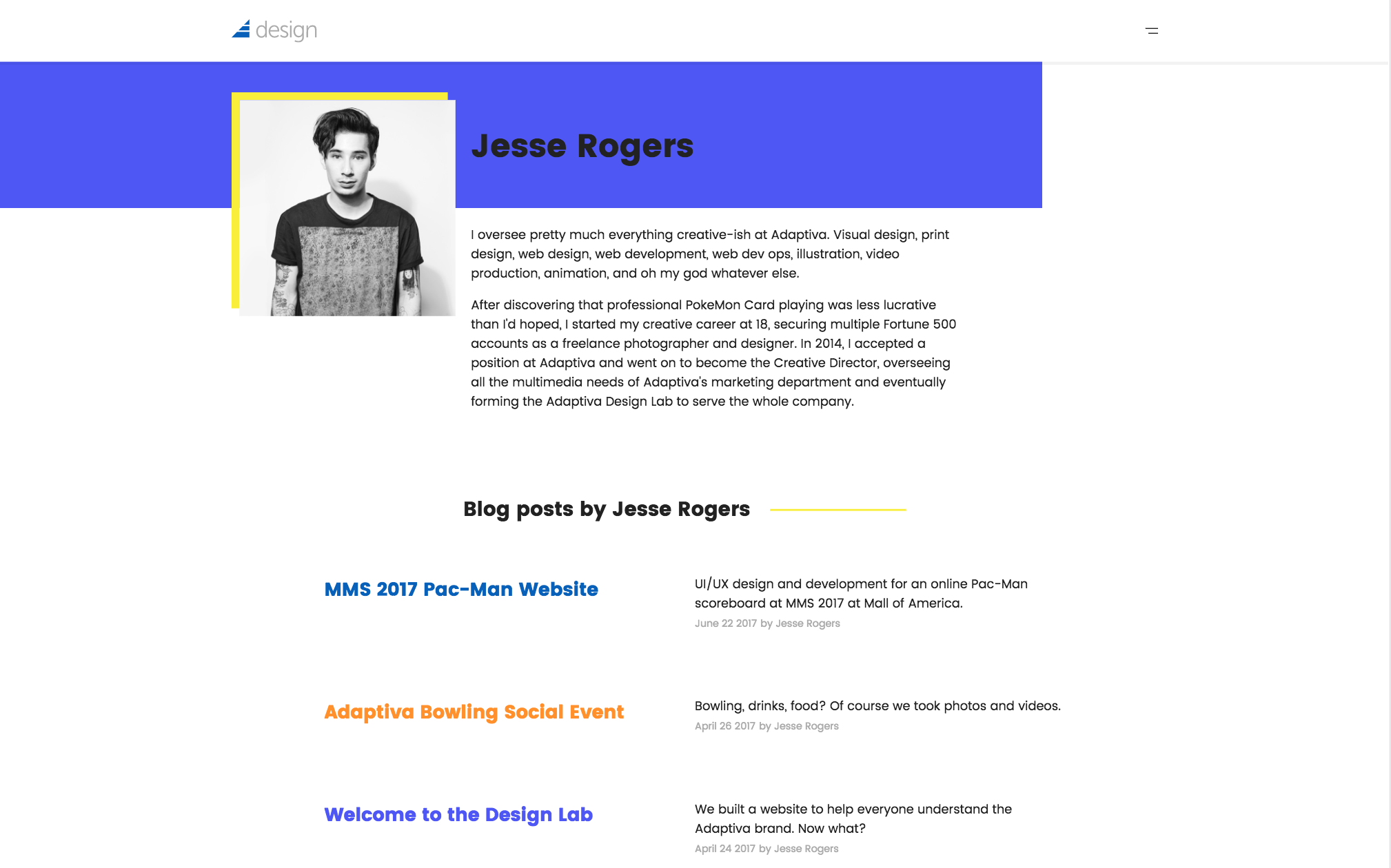
Authors have their own pages with bios and a list of their posts.
I had so. Much. Fun. Coding this website.
Like I mentioned before, I leveraged the Github Pages Jekyll-based platform to make this website, which is a web developer's dream compared to dealing with WordPress.
No servers to deal with, no server security issues too deal with, effortless local development, powerful templating and looping features, and all sorts of stuff.
I really like coding static based sites with Jekyll. Even this portfolio site is made with Jekyll.
Anyway, basically, the site is all HTML5, SCSS, and jQuery. I designed and coded the whole thing in about three weeks. I don't have that much more to say about the code (I mean, it works? lol), but if you want to get into it, check out the Github repo.
This isn't really the type of project with quantitative results, but awareness to these resources is on the rise in the company. More and more of our employees are starting to head there for branded assets for their PowerPoint presentations, as well as the color guidelines to keep super weird colors from showing up in company documents.
Maybe I'll do yearly updates on the design of this site to keep it on the cutting edge. I'm sure this design will look ridiculous to me in two years, but that's the fun of having access to source code, no?